
26 August 2026 · 1 min read
Damask Weave Explained: Why High-Density Labels Feel Luxury
What 'high-density damask' actually means, how pick count changes label quality, and how to spot a cheap weave before you order.
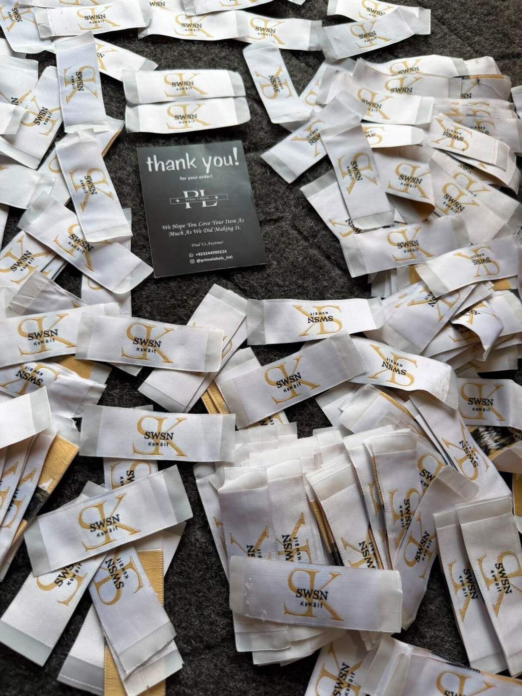
"High-density damask" is the phrase every label supplier uses. Here's what it actually means — and how to tell real quality from marketing.
What damask weaving is
Damask labels are woven on jacquard looms where the design is formed by the weave itself — threads crossing at high pick counts — rather than printed on top. The result: the logo is in the fabric, not on it.
Pick count: the number that matters
Pick count is threads per centimetre. More picks = finer detail, smoother surface, softer feel.
| Quality tier | Picks | What it looks like |
|---|---|---|
| Budget | ~120 | Jagged edges on curves, fuzzy small text |
| Standard | ~200 | Clean logos, limited fine text |
| High-density | 300–340 | Sharp small text, smooth gradients, soft hand-feel |
Our woven labels run at the high-density tier — that's why fine text like a website URL stays readable at 8pt equivalent.
How to spot a cheap weave
- ✦Curved letters look like staircases
- ✦The back is a mess of loose floats that itch
- ✦White base showing through dark designs
- ✦Edges fray after a few washes (no proper heat-cut or selvedge)
Density vs softness — the tradeoff myth
Old looms forced a choice: dense OR soft. Modern 100D polyester yarns at high pick counts give both — dense enough for detail, soft enough for skin contact. Ask any supplier for a photo of the label BACK; that's where quality shows.
Want to see your logo woven before paying? Our free 24-hour digital proof shows exactly how your artwork translates to thread.
Ready to put this into practice?
Send your design and quantity — a tailored quote lands in your inbox within 24 hours, with a free digital proof before production.